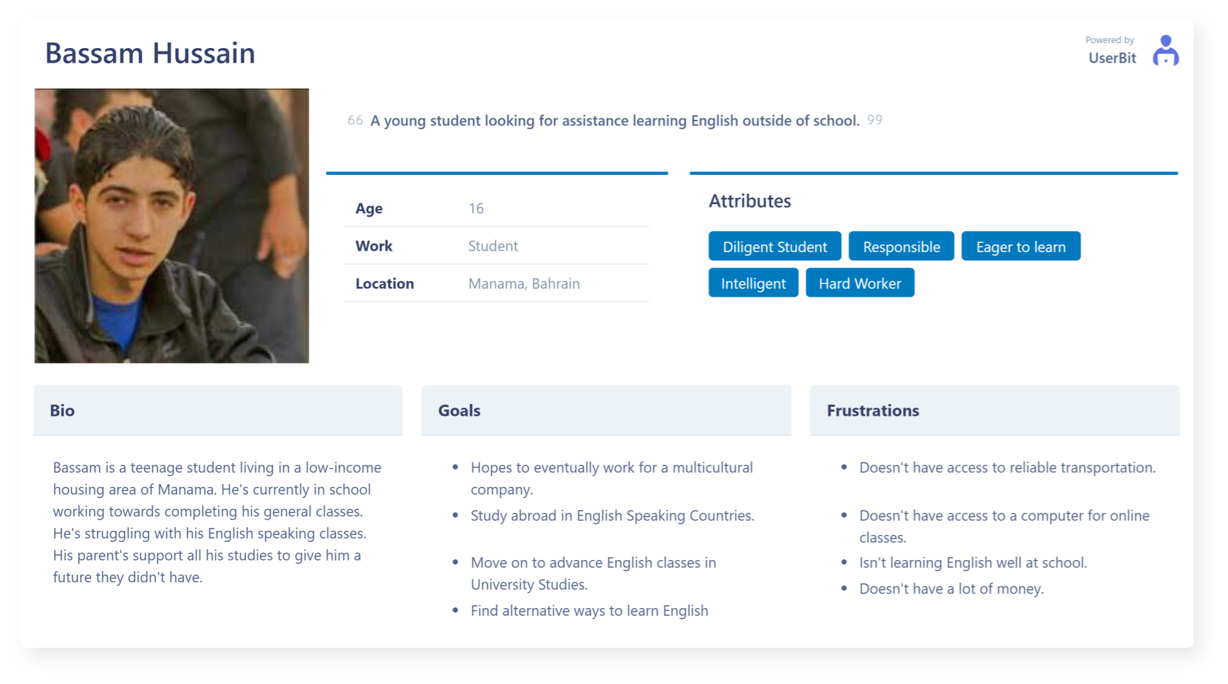
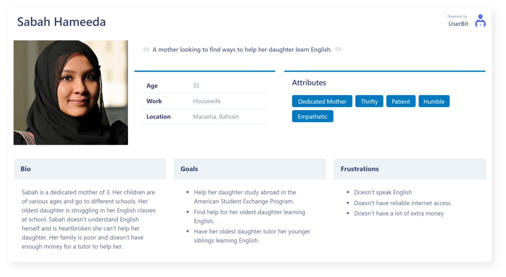
Before making any decisions we established who are the users we are designing for. We created our personas from the information we gathered from the stakeholder. We generated two personas, a parent and a child. These personas will help the team keep in mind who we are designing for.
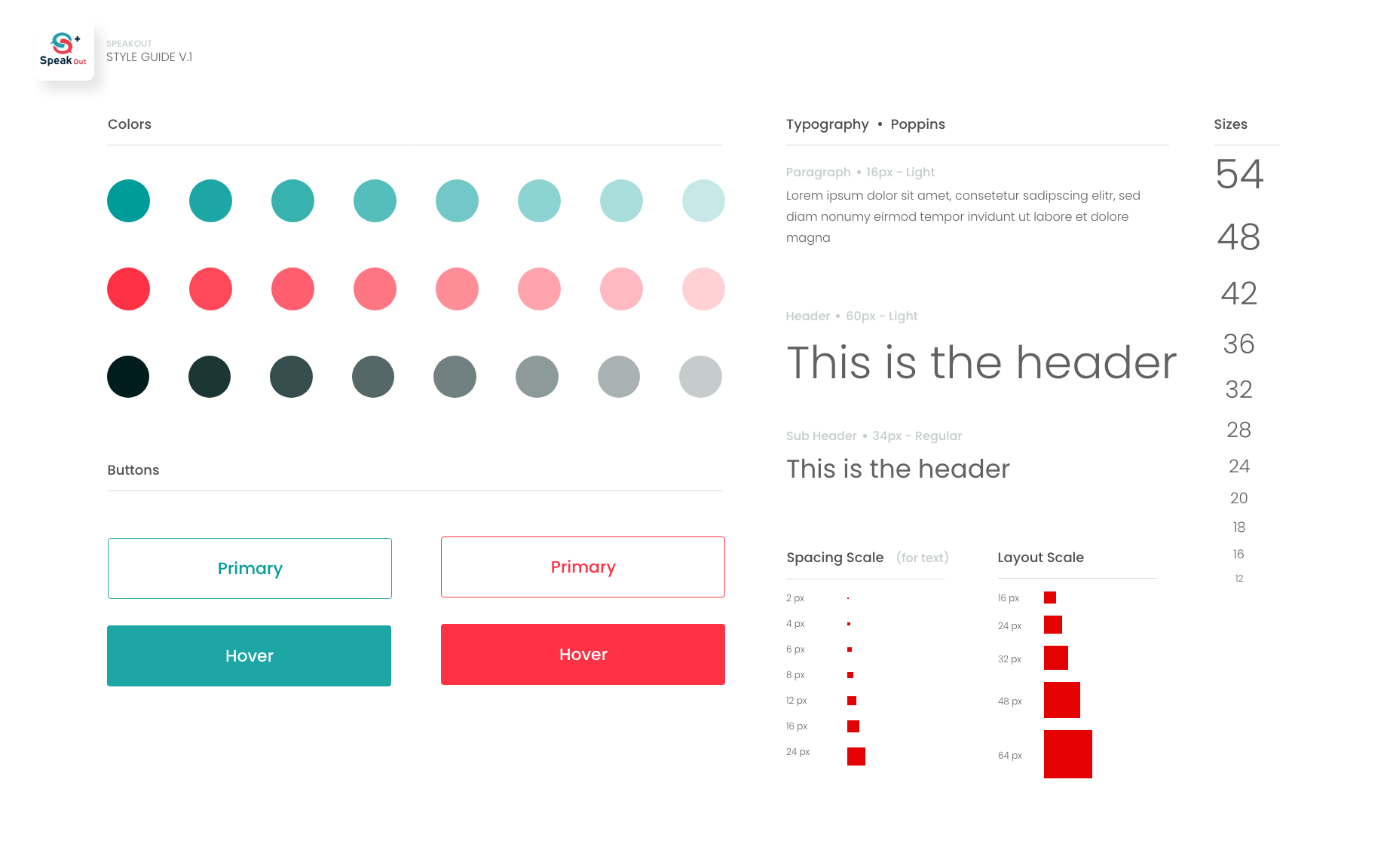
One of our first observations within this project was the lack of a style guide. Speakout already had a logo which we weren't allowed to make any changes to. We used the colors from the logo to establish a consistent style guide. We decided to poppins for this project due to the versatility of the fort and the ablity to combine it with another font if needed.
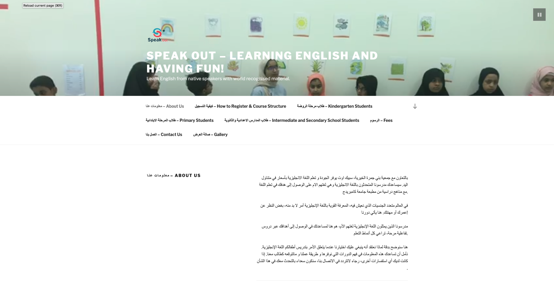
The original site map consisted of many pages with repetitive information the could be consolidated into lesser pages for a better user experience. I restructured the site map with with the all of the information gathered and sorted into a more efficient sitemap.
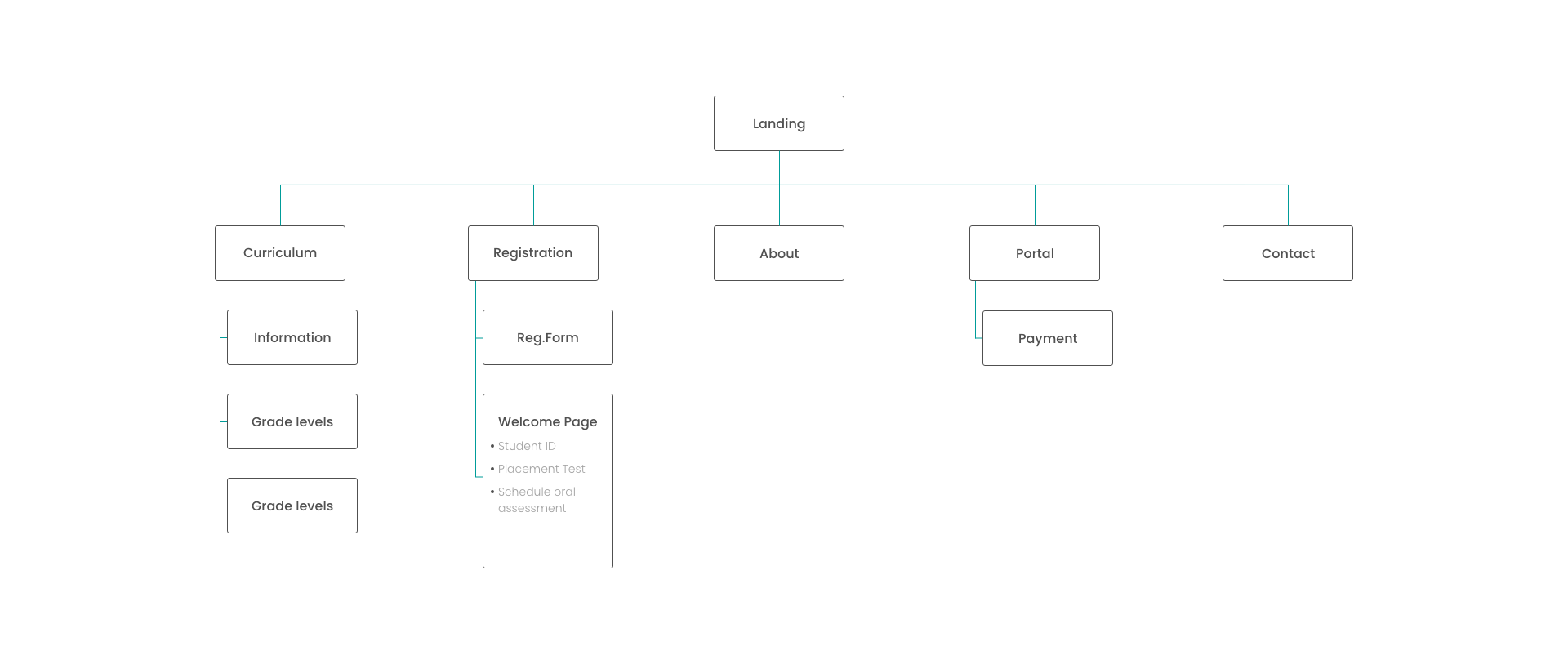
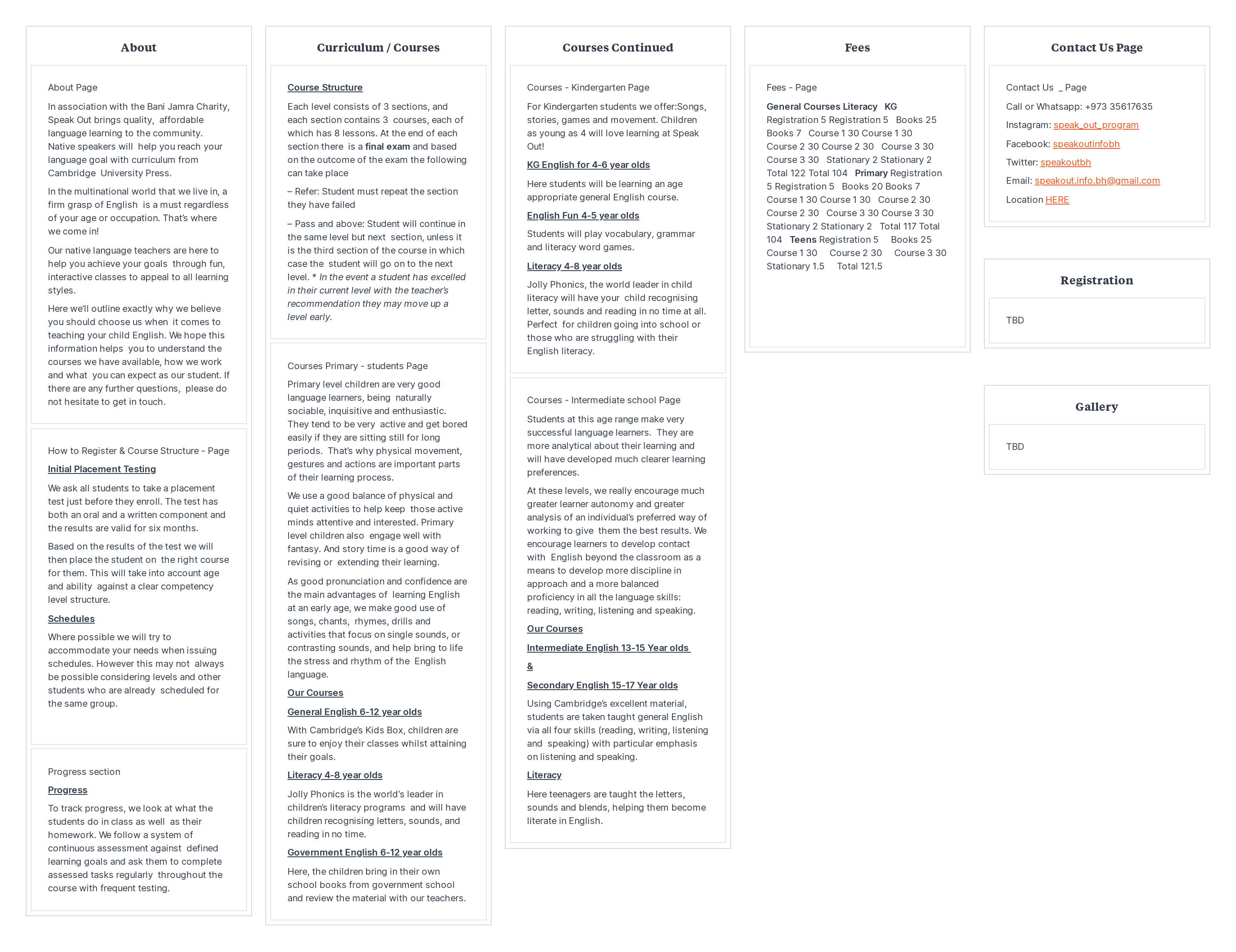
With all the information gathered onto one board I was able to effeciently gather all the information within the site and filter them to appropriate pages for optimal navigation within the re-design of the site.
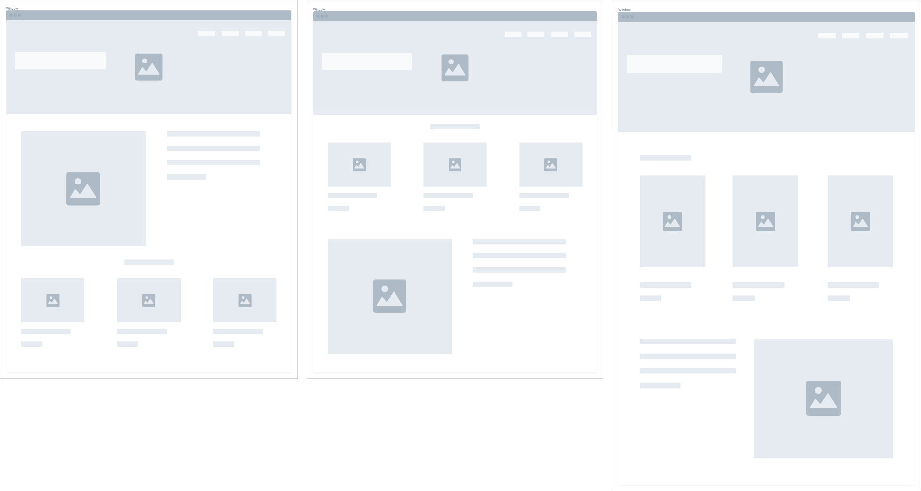
We designed wireframes with all the necessary components for a successful landing page. The wireframes provided direction for the high fi composites and what the final design would possibly look like. The wireframes provided the basic functionality of the page rather the visual detailed aspects of the product.
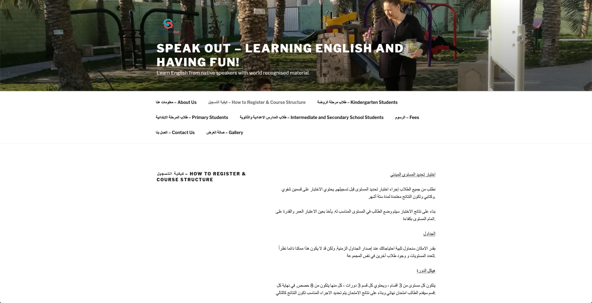
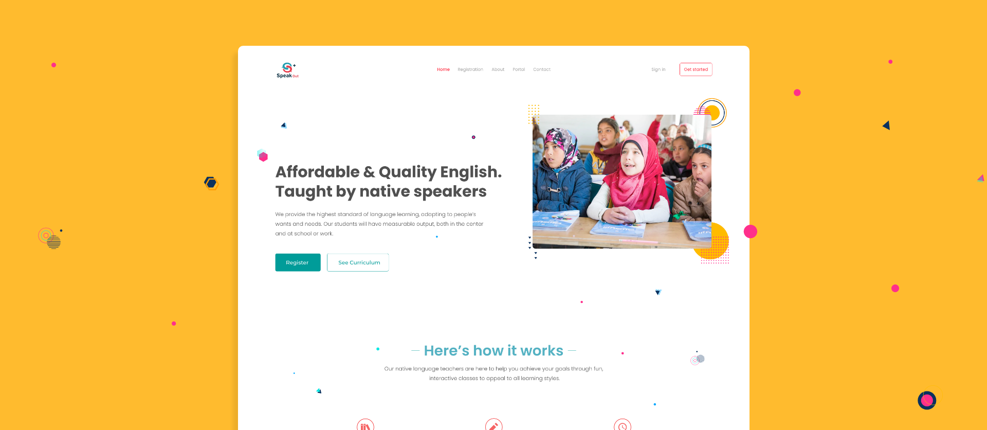
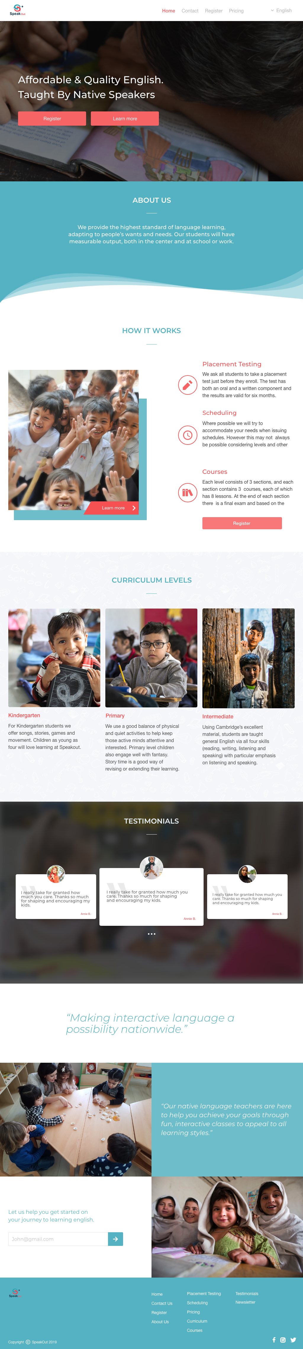
I created this landing page based off of the some sketches and wire-frames I made during the design phase. I drew inspiration from examples I gathered online. Although at the time I believed the design served the needs of the stakeholder I believe that my attempt at re-designing the landing page did not meet my personal expectations of what I intended. The new design was presented to the stakeholder and was met with gratitude but the stakeholder thought it was best to go in another direction with the product.
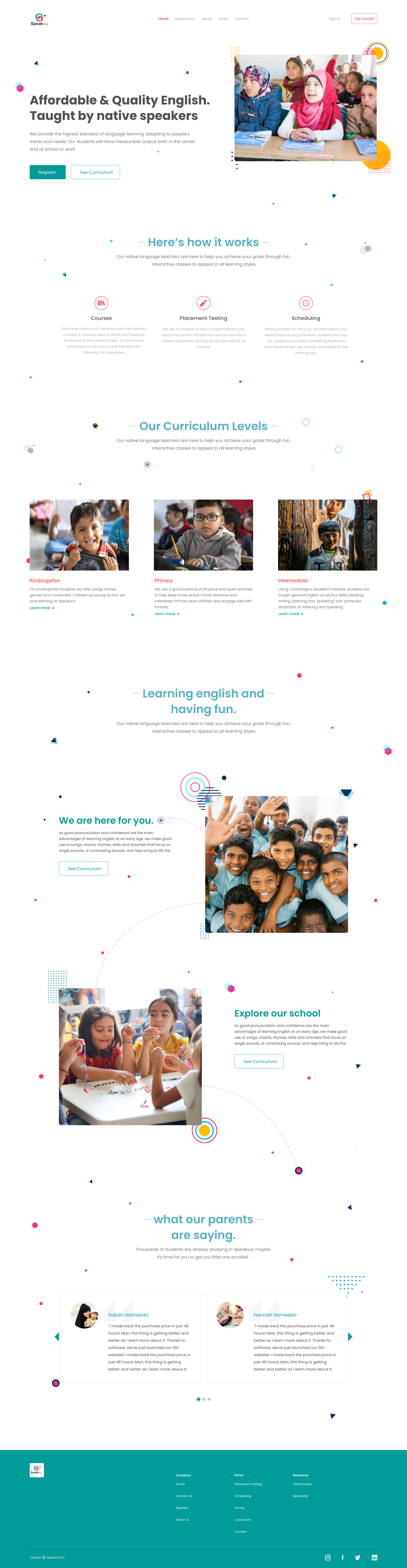
After the first presentation I decided to revisit the product to find areas where I could improve on the design. I recreated wire-frames, analyzed other platforms with the similar goals, re-iterated on designs, established a theme and voice for the re design. I decided to let the design breathe more by utilizing white space, establishing a spacing scale, reduced the amount of colors used on the page and changing the font. The design below was not presented to the stakeholder due to their decision to go with another design.
If you like what you see and want to work together, get in touch!
Peterd.noel@gmail.com